We've copied the shapes of the rooms that were on the board game, as we wanted to keep attached to the game, but will change other things like diffrent furniture. before any concept i wanted a balanced layout of the objects in the room so did these little quick drawing of where i could put the furniture and where the light would come from.
Wednesday, 24 March 2010
Collage my ideas
I wanted to visually get accross to myself the and the group the kind of things we intended our rooms to look like, so i just collected some items and empty rooms and stuck the together in photoshop. They arnt exactly what i imagine the final to be like, but it gave me more of an idea to work on.
Obviously, these are in daylight and the mansion will be set in the evening, but all i wanted to see was a didning room with a weapon. The rooms wont be like this, as they will be a diffrent shape and size and more live. It will seem as though a 'stuggle' has taken place and someone has just left the room or the building.....
Lets look at some lighting and accessories
I wanted to think about how light would effect what i chose to have in my room, the atmosphere i want and time of day. I looked at candlelight, as i think that a candle stick would be the appropriate weapon of chioce for this room. If candle light is needed, then it will either be evening of dark outside. We discussed this, and agreed that late evening will be best, as it will mean the travelling of corridors will be eery, and light will pour into the rooms from doors and fireplaces.
I'm taking on the dining room
and the kitchen. We decided to start with two rooms each, and if those goes well we'll work on more to complete the whole game, but intend to make it easier by sharing objects if we need similar to fill our rooms, which will aslo give a sense of continuity aswell as saving time. To start the didning room research i looked at dining rooms in general, and then mansion dining rooms. From this i could see there are distinct objects and style in mansions, manor's and other larger abodes. Everything is much more exaggerated, floral, curvy, grander, regal, darker and expensive.
Cluedo Mansion
Well another layout project, but this one needs a narrative, and wot started as a joke suggestion is now a final idea. Harry, Faye and i are attempting to make a camaera walk about a masnion by making the rooms based on the ones in the board game cluedo. It will aslo be populated with furniture and a weapon. To make more of a suggestion of murder, we aim to have the rooms unsettled. Ciggarettes still smoking, Lampshades swining and disturbed ornaments will hopefully give the viewer a sense of fear and suspision. To start with, weve looked at the board game, its layout, history and time period. The original is set in the 30's but i think that furniture will still be left over from the 1800's and even resemble the victorian style.
Friday, 12 March 2010
More textures...
Texturing plus
I started to texture the plaster on the back building and left building first. Close,up they look fine, maybe the bumps are a bit too indented, but in some renders it looks a little bit unproffesional. I havnt let this put me off yet, and continued with bricks on the side of the canal, which i sort of like, but only look nice nearer the camera. But i do like my water texture, which looks quite good even though its just a plane with a bump.
Starting in MAYA
Well before modelling anything, i had my camera angle sorted with top down view, i also roughly drew the fronts of the building i will be needing. I did plan to do a blockout of the whole thing to make sure the scale and layout was fine, but one i started on the front of the back building i just got carried away and it just became a final model. I did this with all of them, then scaled and arranged them after, which i know isn't the right way. O, and i had also added some textures at this point.
The lighting was a bit troublesome, but i think the only problem really was me getting confused with which light needed to be linked to which buildings. The lighter one was me just playing with render settings, but i kept it as its a nice picture to see what the modelling is like.
The Glory Hole
Now having my idea i moved on to designing and finding a time period, as the current building wernt very exciting, and i did want it to be in with the previous idea that the image would be like a 3d old photograph. I did look at medieval style paintings and stole a few building designs.
My initial concept seemed good at the time, but i did rush it and can't paint well in phtoshop, all i really did was block colour and blur, twas not very acurate or nice to look at. I also set it during the day, which didnt give it any atmosphere. But after some colour theory, and more inspiration, i tried agiain, this time using Painter, and created something i like.
I would like to have the final more 'grubby', i know it's going to look too clean in 3d, so will aim to experiment.
Layout Design New Brief
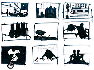
Like any new project a new brief is given, this one was diffrent to previous as the group was split into pathways e.g. 2d, 3d Animation and layout. As much as i did enjoy 3d animation, i loved the previous layout project more. As this brief was pretty open, my initail ideas were large. I was thinking more on the scale of a game level, but after too much time deciding this idea was not possible. To start with i was looking at layout in general, how paintings work and in lessons looking at silhouettes. Doing these helped alot with judging readability.
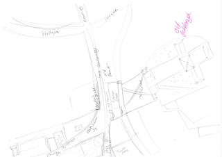
After some time researching and gathering ideas, i was inspired by painters who had series' of paintings of the same place, just from diffrent angles or streets. I was thinking of Edward Hopper, and how his paintings are mainly building, but look like they could be next door to each other. With this one i couldnt figure out a map, or where this place might be. I had a few paintings of John Constable's, and as i had visited Stratford and been to the site of Flatford, where such paintings as 'The Haywain' and 'flatford mill' were produced, i knew the layout and could make a map of there these painting veiws had been.
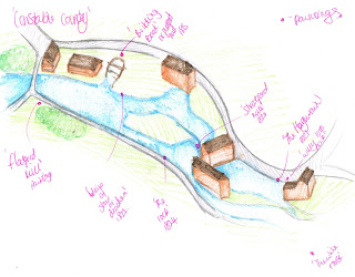
What i wanted to gain from this was an almost 3d tour of the site, with the camera giving the veiwer a sense of where Constable would have stood to paint his paintings, and how they related to the other paintings. I did envisage the 3d model painted similar to the originals.
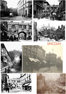
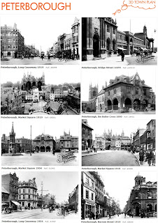
With this idea in mind, i also looked at old photographs, and that how i would use the same concept to give the viewer a look at how a place would have been decades ago, like a 3d black and white photograph. I took a look at Lincoln and my own town centre and gathered photographs from all angles, and roughly planned the layout.
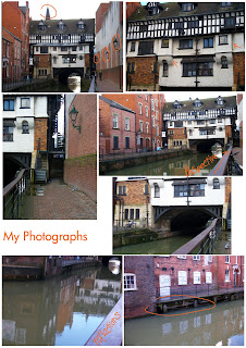
I think this would be a lovely idea to try another time as there was not enough time to attempt this idea. i needed something more confined. On a day around lincoln gethering reference and inspiration, i realised there is a nice canal alley, with i Bridge surrounded by old buildings. This was what i needed. Something closed off, where the lighting could be controlled, and would be more fitting to the time remaining.
After some time researching and gathering ideas, i was inspired by painters who had series' of paintings of the same place, just from diffrent angles or streets. I was thinking of Edward Hopper, and how his paintings are mainly building, but look like they could be next door to each other. With this one i couldnt figure out a map, or where this place might be. I had a few paintings of John Constable's, and as i had visited Stratford and been to the site of Flatford, where such paintings as 'The Haywain' and 'flatford mill' were produced, i knew the layout and could make a map of there these painting veiws had been.
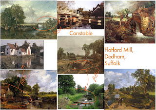
What i wanted to gain from this was an almost 3d tour of the site, with the camera giving the veiwer a sense of where Constable would have stood to paint his paintings, and how they related to the other paintings. I did envisage the 3d model painted similar to the originals.
With this idea in mind, i also looked at old photographs, and that how i would use the same concept to give the viewer a look at how a place would have been decades ago, like a 3d black and white photograph. I took a look at Lincoln and my own town centre and gathered photographs from all angles, and roughly planned the layout.
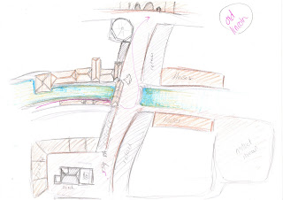
I think this would be a lovely idea to try another time as there was not enough time to attempt this idea. i needed something more confined. On a day around lincoln gethering reference and inspiration, i realised there is a nice canal alley, with i Bridge surrounded by old buildings. This was what i needed. Something closed off, where the lighting could be controlled, and would be more fitting to the time remaining.
Subscribe to:
Posts (Atom)